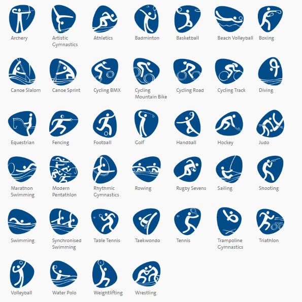
Did you know Rio Olympics is the first event to have pictograms for all events?
Branding events never comes easy without consulting with stake holders and Rio committee took the challenge to develop pictogram but the legends in the games constructed the visual idea for implementation by the design team. What are pictograms you may ask? Pictograms are graphic icons facilitating the visual identification of each event and are a Games tradition.
In 2016, each Olympic and Paralympic sport will be represented by a unique pictogram for the first time. The Rio Games have 64 pictograms – 41 Olympic and 23 Paralympic.
Lets look at the wholesome branding process, shall we! According to the Olympic committee, that Aimed at fostering a celebratory atmosphere and creating memorable experiences, the Rio 2016 ‘look’ is far more than a mere branding exercise – these designs will be a source of inspiration, bringing people and cultures together.
Venues, products, uniforms – everything associated with the Rio 2016 Olympic and Paralympic Games, will have this stamp.
The city will put on its best clothes to host the greatest sporting spectacle on the planet. Inspired by the rich landscapes of Rio and Brazil – full of the sinuous curves of mountains, rivers and lakes – the city’s best-loved icons, including Sugarloaf Mountain and Corcovado, will all take part in the celebration.
And we have not forgotten that five other cities – Belo Horizonte, São Paulo, Brasília, Manaus and Salvador – each with their own iconic identity, will host Olympic football matches.
Our visual language is based on the simple pebble and the Rio 2016 typeface, with organic forms that express motion and performance. The design arose from the contours of the Rio 2016 logos and the elastic illustrations and pictograms are an extension of this language.
The first step in the creative process was to open our eyes to what was around us – the people, places, images, monuments, colors, smells, sensations… this wealth of inspiration became the focal point of a photographic immersion exercise, deepening our knowledge of the city’s visual highlights. It took a little over a year, but in the end we managed to recreate the outlines of this Marvelous City.
Here is a video to take you through https://youtu.be/bH57pbZ5vjI
The Rio Olympics brand
The Rio brand is defined of passion and transformation as it is expected from every athlete, with contagious energy that is celebratory and optimistic. The Olympic spirit raised to achievement and excellence .The nature as they say it is exuberant culminating inspiration and sustainability. Rio diversity calls Unity through the young spirit of success.
The Rio calligraphy font predicts the mood already, according to Rio website,
The design of the Rio 2016 font depicts the essence of the Olympic and Paralympic emblems: Passion and Transformation. The boldness of this creation is not only in the design, but also in its importance for the design market in Brazil. The Rio 2016 font is one of only a few bespoke fonts created by a Brazilian team.
Each letter expresses a characteristic of the Rio 2016 Games, its people and the city. The letters are written in single continuous strokes, with fast and fluid motions, suggesting the movements of the athletes in action. The strong contrast between thick and thin strokes was explored during the design process by putting brush to paper and writing by hand. The variety of the curves in the different letters has a unique informality, inspired by the joyfulness and warmth of the Brazilian people.
All the Olympic and Paralympic brand pillars are represented in the Rio 2016 font, and in the creative process that gave shape to it. ‘Harmonious Diversity’ is seen in the curves, as each one has a unique shape, but they work together as an integrated and unified set. The ‘Olympic Spirit’ and the ‘Paralympic Spirit’ are reflected in the fluidity of the lines, simulating the agility of the athletes’ movements. ‘Contagious Energy’ is also present in the character set, in the different height of the letters, and in the bold connections.
‘Exuberant Nature’ is present in the letters’ overall design, and finally, ‘True Engagement’ is present in the creation process, which included the participation and involvement of several different teams of people.
Courtesy of https://www.rio2016.com/en/brand The visual identity of the Rio 2016 Games is inspired by the harmonic diversity and contagious energy of Brazil’s people and Rio de Janeiro’s exuberant nature. All the elements were created based on the brands, allowing for integration and alignment.

